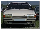
We had both of these colours, unfortunately for breaking, at Medway Citroen. The brown was pretty much as it looks in the picture. The blue was seriously nice, although had a lot of green pigment in it, making it teal really. I'd say it was pretty much Pantone 323. The brown was very brittle, but the blue stood up to abuse fairly well.
And if we're getting really anal it'll be the blue and green pigments added to the base plastic that made it slightly more durable than the brown, which contains a lot of red and yellow pigments, which are far more susceptible to UV.
Sorry Stinkwheel, Charlottes right. Having mixed a 'lot' of colours mainly paints and gelcoats but also specified Pantone, RAL, BS, AFNOR and corporate colours plus creating custom colours etc you use pigments to create colours. The Swedish NCS (Natural Colour System) is in my opinion the best for nailing a colour - its what Dulux used (then left and returned to) and still do. The only thing it does leave out is metallics, pearlescents and the colour shifting paints, but the base tones are effectively covered.
Because pigments are not actually pure there are as many as 35 base colours (in paints) to mix a match. Believe me its not very easy to get a perfect match especially under all lighting conditions. If you get it right under daylight you are doing well.
Just like some colours 'chalk' with UV some plastic pigments will be better than others for durability. Its also why a lot of boat fittings are black - the carbon helps stop UV degradatiion of nylons.
I'm a graphic designer. Colour is the only thing I know! I'd like to point out that for 27 years I had been calling nissen huts "Nissan huts", until Stinkwheel corrected me at the weekend.
NCS is definitely superior to Pantone. I have always found there is a huge margin for error with the Pantone system, especially with blues/indigos.
Thanks for that Charlotte. I'm an industrial designer and now a boat builder/repairer with a bit of design work and prototyping etc. Degree (2.1Hons) from Leicester Poly in 85.
Interesting you prefer the NCS too. Was way back around 88/89 when I first came across it coming up with colourways for a UK fridge manufacturer. Have prefered it ever since.
Ah, Printmaking/Illustration BA at KIAD (Maidstone College of Art)!
Sadly Pantone have successfully marketed themselves as a hipster lifestyle brand, and got into bed with Adobe. I have been given Pantone gifts like notebooks which are supposedly black but are printed with cheap inks so you see a lot of green. I know it's snobby but it irritates me that "the best colour matching system in the world" will put their name to a product with the wrong colour on it! I have found that friends who have a job in the industry are becoming disillusioned with Pantone, and the ones who are now hobbyists are still using it. Hopefully this trend will continue.
That is interesting about Pantone. Yes I still have the (too old for accuracy they claim) book of swatches which cost about £105 in 86..... . In the design world there is a certain CAD system which claims to be the world leader called A******, but it is a pig to learn and slow. Much better systems are available in both 2 and 3D. I prefer the alternatives as they are easier, better and much cheaper, what a surprise.
I own commercial 2 and 3D software capable of proper industrial production etc and have access to very high end stuff if needed.
My Foundation was at Epsom College of Art, it was good fun.